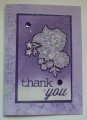
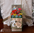
This is my 2nd entry into the Alphabet Challenge for week 2 with the letter P (pale purple posies). I first heat embossed the image using white embossing powder. Then I used 3 colors of purple distress inks and sponged them on starting with the lightest color and going to the darkest color. I left the bottom the very lightest because I thought I was going to stamp a sentiment here, but in the end, I die cut one instead. When you are done with the sponging, take a paintbrush and plain water and paint the water all over your image. Then place a paper towel over the image you just painted with water to lift the color up. You may have to do this 2 or 3 times to get the desired bleaching you want. Now take a dark purple spectrum noir or copic maker and outline the flower image to make it pop off the page more; be very careful to not color on the white embossing because it will change the color of the embossing to purple. If this happens, use a QTip and some isopropyl alcohol to gently lift the color away from the embossing. Also, take a light gray spectrum noir marker and add lines into the flowers for some depth; again, avoiding the white embossing. Take a paint brush and get it really wet with water, and splatter it on your background to create a mottled look. I separated the thank you die so it would fit on the image panel better. The image panel is layered onto BoBunny DSP that is adhered to the card base. I am not positive, but I believe this is a technique I saw by WPlus9 somewhere on YouTube. I really enjoyed watching this card come together with this fun technique.
Date: Thursday, August 4, 2016 GMT Views: 917
Favorited:3
Accessories: Spellbinders 5x7 matting basics A and B dies; PaperTreyInk Thank You Die; Sponges; #2 and #4 paint brush; Spectrum Noir Markers; Misc. Sequins from Michael's Craft Store
Techniques: Bleaching Distress Inks Using Water; heat embossing; sponging; die cutting
So pretty!! I can see why you couldn't stop. Lol I did the same thing on round 1 and even now I still can make more even though my P card is already Entered lol. Purple use to be my fav color , but yellow and pink is not fighting who gets fav spot. Love your creations keep them coming!!
Registered: June 9, 2014 Location: Sullivan, Missouri Posts: 863
Wed, Aug 10, 2016 @ 2:45 AM
Very pretty! Wonderful choice of designer paper and glitter paper and I love that you explained your awesome technique for us. That image panel is spectacular! I love the outlining on the flowers, it does make them pop.
Registered: October 12, 2007 Location: Arizona Posts: 70166
Wed, Aug 10, 2016 @ 7:31 AM
Jaw drop. Gorgeous! It's truly stunning. Thanks for sharing how you prepared this card. Beautiful purple shades. Love the sparkle. Powerful technique. Pretty card and presentation for Letter P. TFS